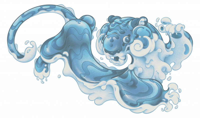

Behind the Water Tiger with T-Wei by Leah Maclean
You might not know his face (by no accident), but you certainly know his artwork. Iconic Wellington artist T-Wei has had his psychedelic, sometimes creepy, sometimes crass, and always cool-as-heck illustrations plastered across Garage Project cans, adorning Wellington walls, and printed with an official Marvel seal. His illustrations tend to turn everyday objects and scenes inside out and upside down.
As a Wellington local with Chinese heritage, his creativity and desire to push the fold and inspire diverse communities fell in line with our vision for Lunar New Year/Chinese New Year celebrations. We engaged in his talents last year and challenged him to depict the sheep zodiac in his surreal style on The New Zealand Portrait Gallery Te Pūkenga Whakaata. This year he has developed the Wellington Lunar New Year Water Tiger artwork, the basis of the festival marketing collateral – from a billboard at the Wellington railway station to promotional fliers.
We chatted with T to learn more about his creative process and inspiration for the aquatic tiger.
This is your second artwork for the Lunar New Year/Chinese New Year Festival. What brought you back?
As a Wellington born-and-bred Chinese it felt important to me to be representative of an aspect of the contemporary NZ Chinese population that isn’t often depicted. Work that isn’t specifically shoehorned into the typical mould of what Chinese art is but nonetheless exists as part of NZ Chinese art.
Last festival you created the sheep artwork for the Zodiac Trail. The tiger is a vastly different animal, did you also feel like you had to approach the assignment differently?
As this was to be the festival’s central imagery this year I leaned more towards representational readable shapes. In last year’s piece I had the context of the viewer specifically visiting to check out the image, so there’s a lot more room for the viewer to sit and squint for a minute and interpret the work. In the context of advertising a festival it seemed more important to have something readily digestible for a general audience who may only get a quick glance before they carry on doing their daily whatnots.
You had specific elements to work with... a tiger and water. What was your methodology in combining these? Did you seek inspiration from anywhere, did you create a mood board? Or did it come to you in a dream?
The concept came about fairly quickly in a chat with Linda [Lim] and Jacqui [Dong], the organiser and designer of the festival. The box motif is something I’ve used a lot in my work previously, representing restriction – a concept I’m sure most New Zealanders are familiar with this year – with the LNY moon’s gravitational pull on the tide acting as a catalyst for breaking out of said restrictions. Aesthetically I spent some time looking into traditional Chinese depictions of water and waves, mixing my own contemporary urban influences with the traditional forms to pay homage.
You have created a couple of different iterations of the Water Tiger. Are you able to describe what your vision was for each one?
Each piece took their cues from their locations. The railway station being somewhat of an entry to the city meant it could serve as an introduction to the tigers, providing the context of the tigers in boxes that would make up the fliers and posters scattered around the inner city. The Jervois Quay banner depicts a group of tigers who have escaped their restrictions and are frolicking freely towards the waterfront and the tidal wave is on TSB; at the waterfront where the festival usually culminates indicating a crescendo to the festival.
What excited you the most about working on these particular artworks?
Being given the opportunity to contribute to the contemporary Wellington Asian community. Thanks team!
Your artwork has really modernised the festival aesthetic. I can picture the tiger fronting the marketing of a big indie music festival... What do you want people to take away from it?
As most artists would, I’d love to see people taking the time to absorb their interpretation of the message and have a lasting internal conversation about how minorities may or may not feel living in NZ. For younger Asians viewing the work I’d love for them to see it as something digestible, and (loftily) to see an alternative version in what it means to be an Asian existing in a Western society.
How does it feel to see your artwork up in large scale places? Like Jervois Quay Bridge, or the sheep on the doors of the NZ Portrait Gallery?
It’s always nice, even if daunting. My personal goal when making work for public spaces is to push the piece a smidge past what the viewer’s comfort zone may be, not so much as to cut off the conversation but just enough so it’ll punch a little harder than the more corporate advertising material it will be competing with. There’s also something fun about cheekily strong-arming people into reading your rants in coded illustrated form.
As mentioned, this is your second Zodiac piece. Which animal would you like to work on next?
They’d all be fun design challenges, of course dragon and tiger are the easier ones. Last year’s sheep was a toughie. Pig would probably require some mental gymnastics. Let’s go with pig.
Originally published at www.lunarnewyearfestival.co.nz in January 2022.
View more articles from:
« Issue 164, February 1, 2022

