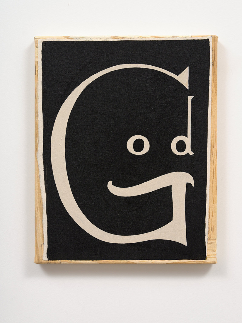
The Letter God by Julian Hooper
Playful and puzzling by Alessia Belsito-Riera
Juxtaposing the ordinary with the unexpected, the playful with the puzzling, the literal with the metaphorical, Tāmaki Makaurau-based artist Julian Hooper celebrates and interrogates the endlessly iterative nature of the alphabet in his newest exhibition.
Fittingly, Julian Hooper: The Letter, which will run until the 16th of November, is City Gallery Wellington Te Whare Toi’s first in a series of exhibitions to be displayed at the National Library of New Zealand Te Puna o Mātauranga o Aotearoa throughout 2024 and 2025 while their permanent space in Te Ngākau Civic Square is under construction.
“Art and literature have always been close companions and we’re excited to bring Pōneke more exhibitions at our National Library of New Zealand location,” City Gallery curator Megan Dunn says. “This is just the beginning.”
Hooper’s show will include paintings, works on paper, and a new alphabet frieze that has also been made into a beautifully designed foldout alphabet for visitors to take away.
“The Letter celebrates the endless potential of the alphabet as a visual tool,” Dunn explains. “If you love Wordle, you’ll love this exhibition.”
Describing his own style as “graphic design with a psychological element,” Hooper is known for crafting compositions that are stylish and stylised, that slip in and out of geometric abstraction.
The artist can trace his francisation with the alphabet back to when he was in intermediate school. Over the past decade, his work has developed an idiosyncratic visual language drawing on letters, numbers, and symbols, leading to the creation of his first alphabet painting in 2018. This set the tone and direction for The Letter.
“I want to make something that’s beautiful and meaningful,” Hooper says. “I also want to surprise myself, so I’m always looking for ways of working that pushes me in to new territory.”
Dunn says that she loves the way in which the alphabet can be played with endlessly. How it can be used as a teaching tool for children while also retaining a role within graphic design, art, and topography. “It’s kind of a designer’s delight,” she says.
Hooper’s letter paintings can be read literally and metaphorically. Groups of numbers become faces and portraits, individual letters and words are made strange again.
“They are often black and white, like an old-school chalkboard, but they’re really catchy and have instant visual hooks,” Dunn adds. “His works have puns and playfulness in them that will naturally appeal to those who love puzzles and visual puns. They’re seemingly simplistic but they stem from years of process and play. The Letter acknowledges this terrific chapter in his painting practice.”
Hooper hopes visitors will leave his exhibition with “new eyes for simple things” and that they’ll feel as though they have discovered “something that is simple, ordinary, and somehow precious or a bit magical at the same time”.
View more articles from:
« Issue 228, September 10, 2024

